This is my portfolio 😛
PROJECT 1
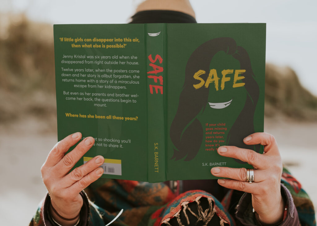
For this assignment we were told we could choose to create any design for a channel of our choice. This was designed to allow us to practice and explore our own personal design style. I decided to redesign the cover of one of my favourite books. The book titled ‘Safe is a stand-alone book by the author S.K. Barnett. The book follows the story of a girl aged sixteen who returns home after being kidnapped at age six. And although she is welcomed with open arms the questions begin to pile up as things do not make sense. The Main character as we find out is not the six-year-old girl that went missing all those years ago but a con artist.
For the cover of the book, I chose to feature a silhouette of the main characters hair in a way that looks unnatural, as if it could be a wig. This is to show that the main character of the book can change her identity based on who she is pretending to be at that point in time. The cover also features a smirking mouth symbolising that the main character does not have good intentions when she shows up on the family’s doorstep. Across the area where the characters eyes would be is the title of the book ‘Safe.’ It is positioned in such a way to look like a blindfold over the eye to symbolise that the main character is also going into this new
family blind and that she might not know everything that she needs to know about this family. In the neck of the character is a prompt to intrigue the viewer enough to read the book. The prompt creates an interest in the book and its story.
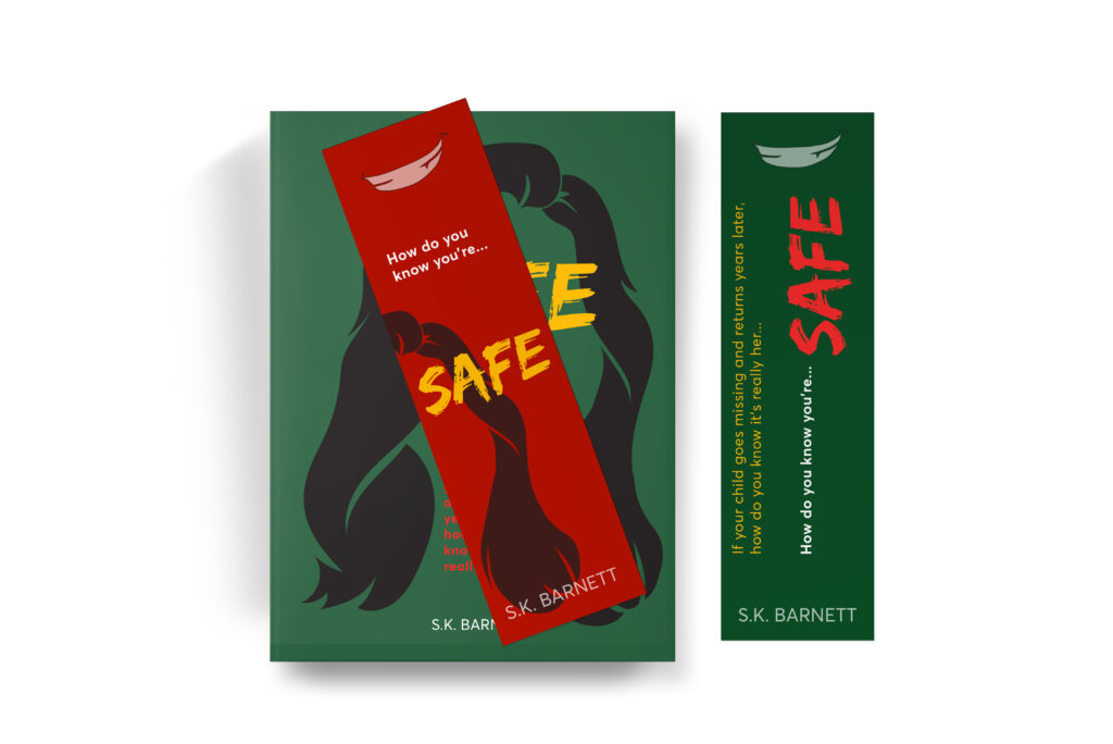
To accompany the design of the book a bookmark design. The front featuring the smirk and hair from the book cover with the prompt ‘how do you know you’re safe’ which incorporates the title of the book. The back of the bookmark features the same prompt from the cover of the book along with the prompt from the front of the bookmark so that the bookmark can create intrigue from which ever way the bookmark is placed down.
PROJECT 2
For this assignment we were tasked with designing a campaign for social change, with a focus on sustainability, in South Africa. We were to couple with a local brand of our choice and choose one of societies’ wicked problems to solve. The campaign had to be accurate to the brands current look and feel.
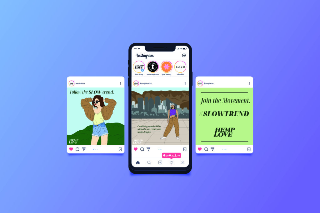
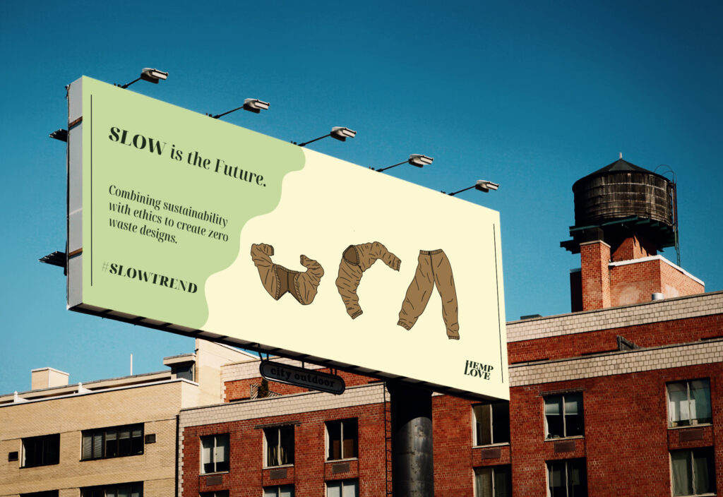
I chose to work with the Hemp Love brand to address the issue of fast fashion. Hemp Love is a female owned sustainable fashion brand located in the heart of Cape Town. It offers timeless, superior quality designs with a conscious and eco-friendly footprint. Through my research I found that there are over 70 truckloads of clothing that is considered to unusable and textile waste that is either dumped onto various dumping sites, burned on open fires, or washed out into the ocean every day, which is harmful to the planet and the people living on it. I used this information to try and find a solution that is sustainable long term and of excellent quality so that the clothes could be used again and for unique styles depending on the persons preference for the day.
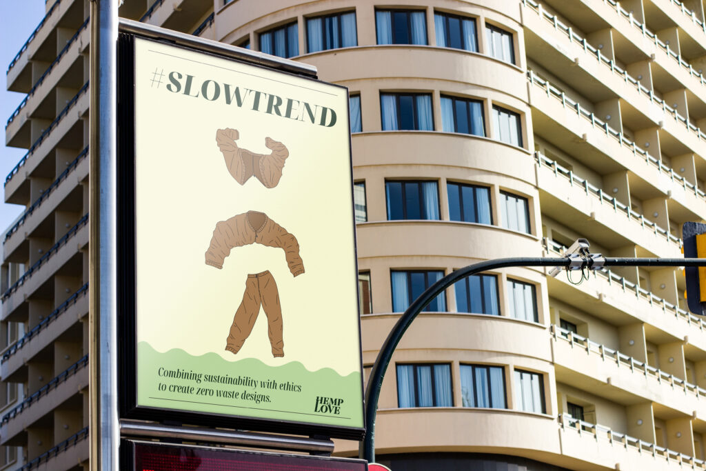
This then stemmed the idea that clothes could be turned into other things which then lead me to interchangeable clothes. Clothes that could be switched from one thing to another. For example, pants that can be turned into a jacket or a top that can be tuned into a bag so that the wasting of clothes could be minimised. I wanted to reach a young audience as they have a better understanding of the modern trends and are very opinionated on sustainability in the modern day. I wanted to target young people between the ages of 21 to 35 who are looking for alternative sustainable options and are opinionated on the sustainability of the modern day.
The channels I used to communicate with my target audience it firstly, Instagram as this is the social media platform that many people this age use on a daily basis as their main source of social media. I then wanted to be able to communicate with them through their workplace or schools which is when I chose to use posters that could be put up and could be seen every day. I also thought of their commute to and from their workplace, school, or any other place they might frequently drive to and chose billboards as another channel. These channels would all be seen by the target audience on an everyday basis. The Instagram carousel features the jacket that can also be turned into a pair of pants to wear. With a hashtag that will allow them to post their own pictures, under the hashtag, of them wearing the item of clothing. The billboard and poster show the transformation of the clothing from the jacket to the pants.
PROJECT 3
For this assignment we were given the task of creating a package design. We were tasked with creating a completely new visual identity for a product of our choosing. I wanted to create a product design that that changed the perception of how we thought about chocolate. There is a stigma that surrounds the
consumption of chocolate, that it can only be unhealthy for you and that there are no benefits to eating it. Chocolate is seen as an unhealthy comfort snack. This negative perception on chocolate leads to people having a negative relationship with the food. People who are trying to lose weight feel guilty when eating it which leads to this negative relationship. Chocolate, dark chocolate hight in cocoa, however, can have quite a bit of healthy side effects that no one knows about because of the negative stigma that surrounds chocolate. I wanted to create a product that informed consumers of these health benefits that cocoa and dark chocolate can provide.
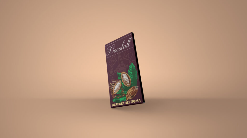
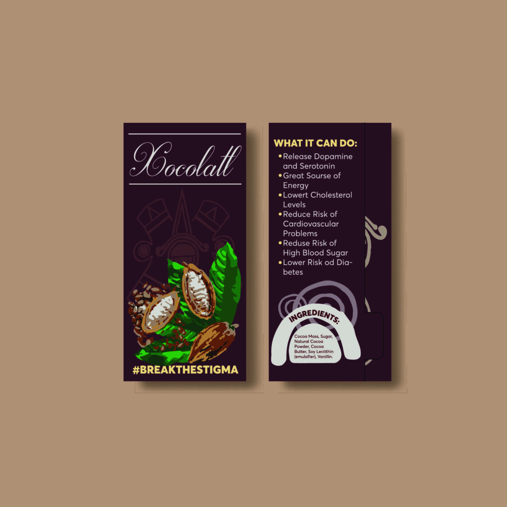
In order to highlight these benefits, I wanted the brand that I created to translates the use of cocoa in the ancient Aztec worlds. They believed that there were many benefits to cocoa and even used cocoa beans as currency. The name of the brand I created translates to a name for a bitter cocoa drink that the Aztecs
believed blessed them. The icon I created is a rendition of the Aztec Eye which symbolises change and
movement as the brand looks to change the stigma and perception that people have of chocolate. I wanted the brand to be clear and transparent with the consumer, so listed on the packaging are the ingredients of the product as well as the health benefits that cocoa may have. The illustration on the packaging shows the cocoa bean fruit, showing where the cocoa comes from, and therefore continuing the theme of being transparent with the consumer. For the actual package design, I wanted to create a design that is easy for the consumer to open so the dyeline is as simple as possible. The tinfoil has areas that fold up and stick to one another which, when pulled on, make it easy for the tinfoil to tear so that the customer easily opens it.
I have also created a simple visual identity for the brand that I created which highlights the logo and its dimensions, the colours that the brand uses as well as the fonts and how to use them the visual identity also shows the pattern that the bran uses in their designs.
PROJECT 4
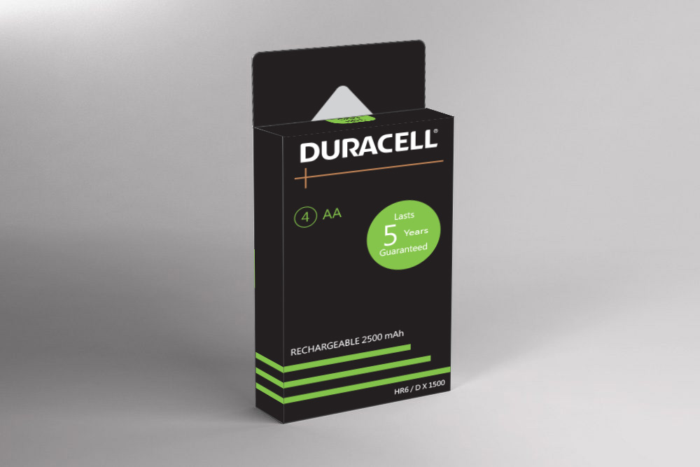
For this assignment we were given different briefs that surrounded package design. I chose the theme Fit for People where I set out to solve a human problem. I chose to design battery packaging because it involves a problem that I can struggle with as well.
I always have batteries lying around in some cupboard somewhere and I wanted to see if others experienced the same problem. Through my research I found that people did experience the same problem. There is not a proper way to seal the current battery packaging that is convenient for future use. People also had a problem with the plastic that is being used in the packaging as it is not eco-friendly. I set out to try and find a solution for these problems. I used the concept “Green in One” to show that it is possible to create a package design that is eco-friendly, lightweight, low cost, and easy to seal. I wanted to prove that there is a better way to package the batteries.
I found inspiration for the new package design from the box that my face cream comes in. it really was not a fancy box, just a standard one that you would find everywhere but it gave me a great idea for this assignments design. I ended up with a wrap around and fold up design that uses no glue. The design can be cut out once and folds together. This made the package eco-friendlier and more affordable to make. It includes an insert with support slits that keep the batteries in place without the need to add extra support which reduces the weight of the packaging and further reduces the cost to make the packaging for the design on the packaging I stuck to the design identity that Duracell has. The information on the package deign highlights the advantages of the product. The information is clear and easy to see which shows the aim of the brand to be transparent with the consumer.